Uber, Airbnb, The New York Times, and other big-name brands are all sending different messages to their customers. One of the best ways to set your business apart from the rest is by using a unique font that makes a statement. As a business owner, you should never underestimate the power of typography in giving your company a distinctive look and sending the right message to your audience.
How do you pinpoint the font that is right for your brand? A good starting point is to choose between two main letterforms which are serif and sans serif fonts. Below we’re going to look at how these two lettering styles are different from each other and which one fits your brand best.
- Serif vs sans serif fonts: Key difference
- Why font matters for your brand identity
- Serif vs sans serif fonts: Meaning, use & examples
- How to choose the best font: Tips & life hacks
- Bottom line
Serif vs sans serif fonts: Key difference
As their names suggest, the fundamental difference between serif and sans serif fonts has to do with serifs, i.e. decorative lines that extend beyond letter edges.
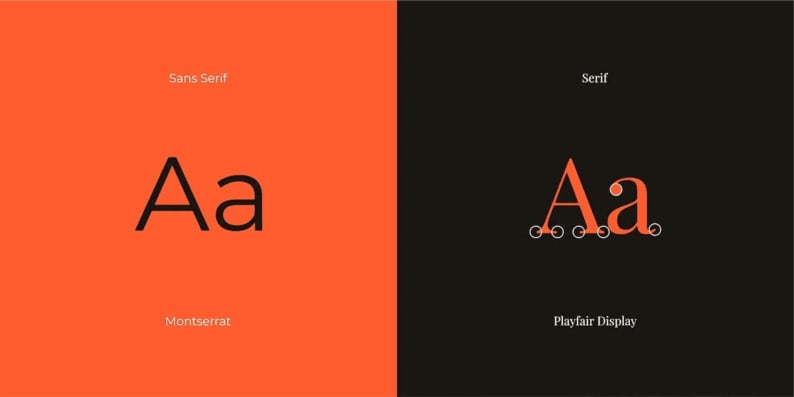
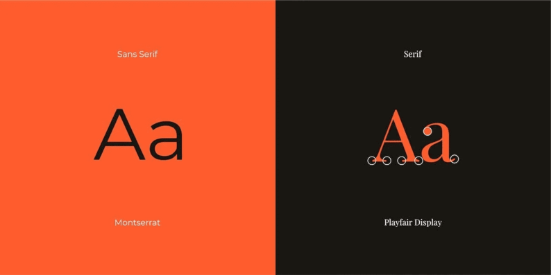
Serif fonts have serifs at the end of each letter. Some of the most commonly used examples include Times New Roman, Garamond, Baskerville, Georgia, and Courier New.
Sans serif (“sans” means “without” in French) fonts are made of straight, simple lines without any serifs. You probably know some of the iconic representatives of this group: Arial, Helvetica, Verdana, Tahoma, Proxima Nova, Futura, Calibri, and others.
Why font matters for your brand identity
Your choice of typography affects how people perceive your brand. On top of that, it determines how flexible and legible your brand identity will end up being. Let’s compare serif and sans serif fonts based on these three criteria.
1. Emotional perception
Take a look at the designs below. The logo on the left belongs to an amusement park, while the emblem on the right represents a law firm. These two brands are using different brand identities — including fonts — to send different messages to the public.

Serif and sans serif typefaces come with opposite emotional connotations. While serif fonts are viewed as formal and classic, their sans serif counterparts look more friendly and modern. (We’ll dive into this later on in the article.) By choosing the wrong typeface, you risk creating an image that has nothing to do with what your company really stands for.
2. Flexibility
Letters devoid of serifs are easier to scale. A font with fewer intricate details stays legible even when reduced in size. On top of that, if you go for a sans serif typeface, you won’t have any trouble adapting it to a digital environment, such as a website, landing page or mobile app. These advantages translate to statistics, with 73% of brands choosing sans serif fonts over those with serifs.
3. Legibility
It’s commonly believed that it takes more trouble to read a text written with a serif font rather than a simpler font without serifs. However, there are no studies that would back up this assumption.
At the same time, there’s research that shows that visually impaired people find sans serif fonts easier to perceive than their more intricate counterparts.
Serif vs sans serif fonts: Meaning, use & examples
When choosing the right type of font for your brand, you first need to find out what meaning you want your typeface to transcend. The best way to absorb this tip is by looking at the typefaces used by global brands.
Serif fonts: Consistent and reliable
Originating from the early days of book printing, serif fonts are older than their sans serif rivals. That’s why serif typography is viewed as classic, traditional, and consistent. This reputation is backed up by numerous studies.
- According to several surveys, people describe serif fonts as “scientific” and “refined” and view them as “stable, practical, mature, and formal”.
- A study was held in which two satirical passages from The New York Times were printed with same-size serif (Times New Roman) and sans serif (Arial) fonts. The two texts were then shown to students who thought the Times New Roman piece to be more funny than the passage printed with Arial.
Serif fonts are a valid choice for brands that want to be perceived as solid, trustworthy, conservative, and rich in tradition. Let’s see what companies are using serif typography to craft this particular image.
The New York Times

Over more than 150 that the iconic newspaper has been around, its classic text logo with intricate serifs has barely changed. Created by a renowned American designer Edward Benguiat, the typeface is slightly reminiscent of the popular Blackletter font. The font’s gothic vibes channel the newspaper’s rich history and impeccable reputation. What we have here is a smart tool that keeps building readers’ trust for decades!
Vogue

One of the world’s most influential and sought-after fashion magazines, Vogue relies on the classic Bodoni font to emphasize its eminent status. Varying line thickness and compelling serifs emphasize the edition’s bold and creative approach to speaking about fashion.
Zara
Although this mass market apparel brand can’t boast a long history just yet, it clearly wants to be associated with iconic premium brands. Following its ambition, Zara opted for the fascinating Didot font which was rated the most expensive-looking typeface.
Honda
Honda arguably has one of the most conservative logos in the world. Just think about it: the design used by the Japanese car manufacturer hasn’t changed in more than 60 years! Channeling the Colt Family and Clarendon Bold typefaces, Honda’s font stands out through its massive lines and bold square serifs. The typeface hits the bull’s eye in conveying accuracy, reliability, and comfort. These are precisely the qualities that customers look for in car makers!
Sans Serif fonts: Available and innovative
Also referred to as “grotesque”, sans serif fonts are viewed as a more modern alternative to their counterparts with serifs. Airy and minimalist, sans serif typefaces are made of simple thin lines that look great across websites and apps.
There’s research showing that people perceive this letterform as “informal and innovative”. That’s probably why typography without serifs is a frequent choice among startups and tech companies. If you want your brand to appear youth-friendly and approachable, you can’t go wrong with a sans serif font.
Nike
Nowadays it’s almost impossible to separate the iconic sports brand from its hallmark typeface! Nike owes its successful brand identity to Futura, one of the most popular family of sans serif fonts. The bold italic typeface (Futura Extra Bold Condensed) fills the Nike logo with dynamics and movement. Here’s an interesting fact. Did you know that Futura is also used by many other top-tier brands, such as PayPal, Gillette, and Dolce&Gabbana? The secret is that thanks to different lettering styles, each logo looks unlike the others!

The easily identifiable font used by Facebook is known under the quirky name of Klavika. Created in 2004, the typeface is almost as old as the digital giant itself! According to its creators, Klavika was designed as a “full-featured, do-it-all serif for the needs of the 21st century. Our result is a design that’s unadorned, modern, and infinitely flexible.” Mark Zuckerberg, founder and CEO of Facebook, personally asked to make the logo more imposing by adding a smooth, flowing quality to its letters.
Airbnb
Airbnb was looking for a font that would reflect its personality and work both online and offline. After being unable to find the right typeface among existing fonts, Airbnb commissioned a custom font and called it Cereal.
The unusual font name is a nod at the company’s backstory. The thing is that Arbnbn — which stands for Аirbedandbreakfast — started out as a small business that was renting places to sleep (inflatable mattresses), with breakfast (mostly cereal) included. Rounded lines and eye-pleasing geometry convey versatility and adaptiveness which are the values that the brand puts first.
How to choose the best font: Tips & life hacks
The recent years in graphic design have been characterized by a trend towards simplification. Top-tier brands are increasingly stripping their logos of sophisticated elements, including serifs. Does that mean that you too should follow their lead? Unfortunately, there’s no cookie-cutter answer to this dilemma. Both serif and sans serif fonts can work equally well in different situations. Let’s see what things you should consider when making a choice.
- Your brand personality. What message do you want to send to your audience through your font? If you want to create a welcoming, customer-friendly image, you should go for typography without serifs. If, however, you aim to make a strong impression on a demanding audience and evoke trust, it’s definitely a serif typeface that will help you achieve the task.
- Communication channels. Think about where, i.e. offline or online, customers will be engaging with your brand. If you’re going to use your logo mostly in print, opt for a serif font. If, however, you have a strong online presence, you should look for a typeface without serifs. If you, like Airbnb, need a versatile solution, look among sans serif fonts that are known to be more adaptable and flexible than those with serifs.
Plus, we’ve put together several life hacks that you might find useful!
- Learn from the best. Make a list of successful brands whose personality overlaps with that of your company and see what fonts they’re using. Analyze what design techniques they choose to portray their unique qualities and characteristics. Adapt these tools to your own brand identity.
- Pick and test several fonts. Test each typeface by scaling it up and down and using it in print and on screen. Choose the option that meets your needs in the best way.
- Combine different fonts. It’s not uncommon for companies to combine 2-3 fonts with and without serifs. You don’t have to spend a fortune and hire a designer to get a smart combination of fonts. Luckily, there are online logo makers, such as ZenBusiness, to help you out! ZenBusiness has in store a myriad of ready-to-use font combinations. Pick the option that brings out the best in your brand!
Bottom line
Serif and sans serif fonts serve different purposes and have different emotional connotations. To make the right choice, you need to define your brand’s personality and determine the tasks you want your typeface to achieve. Don’t shy away from tapping into the experience of other brands. Also, if you can’t seem to find “that one perfect font” for your business, it might be a good idea to use several typefaces!
